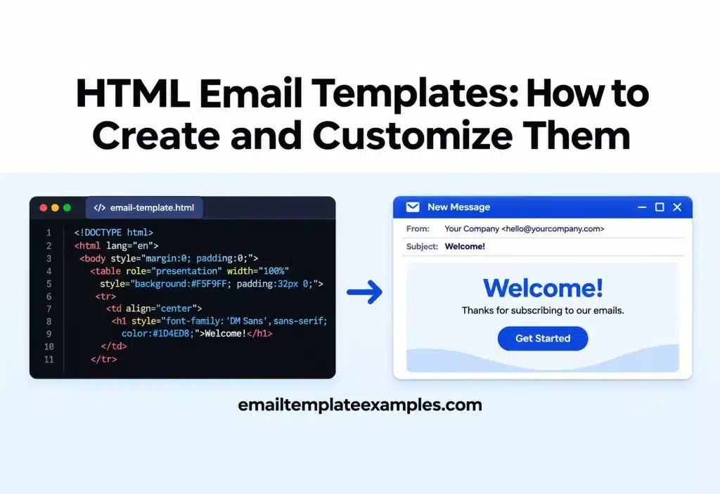
Email clients do not render HTML the way browsers do. Code that looks fine in Chrome can fall apart in desktop Outlook or lose its styles in a webmail app. That is why HTML email templates follow their own rules: tables for layout, styles written close to the elements they affect, and a few client-specific fixes tucked into comments.
This guide walks through those rules at the code level. You will see how a template is put together, what each part does and how to change it safely before you load it into your email platform. If you are new to email design and want the visual side first, our upcoming article on HTML email design starts there.
What are HTML email templates?
HTML email templates are reusable files of HTML and CSS that control the layout, colors, fonts, images and buttons of an email. You keep the structure and swap the content for each send.
Throughout this guide we refer to one real file, the Flash Sale Weekend template from our library. Open its Code tab to follow along. Like every template on the site, it can be previewed and copied without an account.
Step 1: Set up the document head
Start with a plain HTML5 doctype and an <html> tag that declares the Microsoft namespaces. The Flash Sale Weekend file opens with lang=”en” plus xmlns:v and xmlns:o attributes. Litmus’ guide to Outlook rendering explains that the Office namespace is part of the fix for Windows displays set to 120 DPI, where Outlook would otherwise scale some elements and not others.
Inside the head, the same template sets these meta tags:
- charset=”utf-8″ so special characters display correctly.
- name=”viewport” with width=device-width so phones do not shrink the layout.
- name=”x-apple-disable-message-reformatting” to stop Apple Mail from resizing the content.
- name=”format-detection” to keep apps from turning dates and addresses into blue links.
- name=”color-scheme” and name=”supported-color-schemes” set to light dark, which tell clients the email has a dark version.
Step 2: Build the layout with tables
Tables remain the safest layout tool in email. Mailchimp’s page on HTML email limitations lists static, table-based layouts and nested tables as safe to use, and suggests a template width of 600 to 800 pixels. Litmus adds that desktop Outlook on Windows uses Word to render email and ignores most styles on <div> tags, including widths and padding.
A typical structure looks like this:
- An outer table at 100% width that carries the background color.
- An inner table capped at 600 pixels and centered, which holds the content.
- Rows for the header, hero, body sections and footer.
- Nested tables inside rows for columns, product grids and buttons.
Add role=”presentation” to every layout table so screen readers do not announce rows and columns. The Flash Sale Weekend template does this on every table, and many of its tables also set cellpadding=”0″, cellspacing=”0″ and border=”0″ to remove default spacing.
Modern templates often mix in <div> blocks for columns that stack on phones, then wrap them in a table for Outlook only. In the same file you will find a comment starting <!–[if mso]> that opens a fixed 600 pixel table, which only Outlook for Windows reads. This pattern is often called a ghost table.
Step 3: Add CSS that survives the inbox
There are two places for CSS in an email: inline style attributes on each element, and a <style> element placed inside <head>.
- According to Google’s developer documentation on Gmail CSS, Gmail supports both inline styles and <style> blocks in the head, along with most selectors and media queries. It also warns that Gmail might ignore unsupported properties.
- The Can I Email page for the style element estimates 63.04% full support and 15.22% partial support across the clients it tracks.
Because support is not universal, put the styles that matter most, such as colors, font sizes and padding, inline on the element. Use the <style> block for things that cannot be inlined, such as media queries for small screens and dark mode rules. Flash Sale Weekend follows this split: it has a small set of inline styles plus a head block with @media only screen and (max-width:620px) for phones.
Stick to web safe font stacks, or add a web font with a fallback. Mailchimp notes that custom web fonts and background images do not work in every client, so test before sending.
Step 4: Write the preheader text
The preheader is the short line that most inboxes show after the subject. If you leave it out, the client grabs whatever text comes first, which may be alt text or a “view in browser” link.
Litmus’ preview text guide shows the basic method: put a hidden <div> right after the opening <body> tag with your preview text inside. Flash Sale Weekend goes further and stacks several hiding rules on that block: display:none, a 1 pixel font size, zero max height and width, zero opacity and mso-hide:all for Outlook.
Many email platforms also have a preview text field next to the subject line. If yours does, you can use the field and leave the hidden block empty, or remove it.
Step 5: Set images up for Outlook and for images off
Images need three things in HTML email:
- Width and height attributes. Litmus explains that Outlook ignores CSS widths and heights on images and shows them at their actual size if the attributes are missing. Write width=”600″ as an attribute, then add max-width:100% inline so the image still shrinks on phones.
- Alt text. Describe what the image shows. When images are blocked, the alt text is what the reader sees. Every image in Flash Sale Weekend has a descriptive alt, such as a short line about the beach towel in the hero.
- Absolute URLs. Image paths must be full https addresses on a server, not local file paths.
Put prices, codes and headlines in real HTML text, not baked into pictures, so the message still makes sense with images off.
Step 6: Code buttons that always show
Litmus’ guide to bulletproof buttons defines them as buttons built with code instead of images, so they display even when images are off. It covers several methods, including padding-based, border-based and VML-based buttons, and suggests a tap area between 42 and 72 pixels for mobile.
The simplest version is a link styled with a background color, padding and border radius inside a table cell. For Outlook, which ignores much of that styling, the Flash Sale Weekend template adds a VML v:roundrect inside an <!–[if mso]> comment, then wraps the normal link in <!–[if !mso]><!–> so Outlook skips it. The result is one button that looks the same across clients.
Step 7: Handle Outlook with conditional comments
Conditional comments are HTML comments that only Outlook for Windows reads. Litmus lists the main tools for Outlook as conditional comments, MSO properties and VML, and notes that conditional code only works in Outlook desktop clients.
The patterns you will use most:
- <!–[if mso]> … <![endif]–> shows code only to Outlook desktop.
- <!–[if !mso]><!–> … <!–<![endif]–> hides code from Outlook desktop.
- mso-line-height-rule: exactly together with a set line height stops Outlook from enlarging small spacer cells. Litmus explains that Outlook sets a minimum height on table cells and images.
According to the same Litmus guide, the new Outlook for Windows is based on the Outlook web apps and does not use Word to render email, while Outlook for Mac uses WebKit. Older Windows versions are still in use, so keep the fixes in place.
Step 8: Plan for dark mode
Litmus’ dark mode guide describes three ways clients treat colors in dark mode: no change, partial invert and full invert. You can only fully control the result in clients that support @media (prefers-color-scheme: dark).
To prepare a template:
- Add the two color scheme meta tags from Step 1.
- Give key elements class names, then set dark colors for them within the dark color scheme query.
- Use transparent PNG logos, or add a second, lighter logo that appears on dark backgrounds.
Flash Sale Weekend includes a dark mode media query that swaps the logo and recolors text. Our template pages also have a Dark view, so you can check the effect before you copy the code.
Step 9: Customize the code by hand
Once the structure is in place, most edits are small. Work through them in this order:
- Text. Change headlines, body copy and the preheader. Keep the text inside its existing tags so the styles stay attached.
- Links. Replace every href, including the button link in the VML block and the one in the normal link. Missing the VML version is a common reason Outlook users land on the wrong page.
- Colors. Search for each hex code, such as a brand coral, and replace it everywhere it appears, both inline and in the head styles.
- Images. Change the src, keep the width and height attributes in step with the new image, and rewrite the alt text.
- Footer. Add your company address and your platform’s unsubscribe merge tag.
If you would rather not touch code, a free account on our site adds a visual editor and .html or .zip exports. Our planned guide on how to edit an HTML email template without coding covers that route.
Step 10: Test and load it into your email platform
Before importing, check the file size. Gmail clips messages larger than 102 KB, and every template in our library lists its size next to that limit.
Then test in the clients your list uses. For September 2026, Litmus’ market share figures, drawn from more than 1.5 billion opens, puts Apple at 76.56%, Gmail at 16.10% and Outlook at 3.48%. Litmus notes that Apple Mail Privacy Protection affects these counts, so check your own platform’s data as well.
To use the file in Mailchimp, Mailchimp’s custom HTML import guide says custom HTML requires a Standard plan at minimum. There are three import routes: code pasted straight into the builder, a single HTML file, or a ZIP archive. The ZIP has to stay below 1MB, contain a single HTML file and keep every image in the root folder, and the *|UNSUB|* tag is required. Other platforms have similar code or HTML import options, so check their help pages for the details.
HTML email template checklist
Check each item before a template goes out:
- Doctype, lang attribute and Microsoft namespaces on the <html> tag
- Viewport and color scheme meta tags in the head
- Layout tables with role=”presentation” and a 600 pixel content width
- Key styles inline, media queries in the <style> block
- Hidden preheader right after <body>, or the platform’s preview text field filled in
- Width and height attributes and alt text on every image
- Buttons coded as links, with a VML version for Outlook
- Conditional comments for Outlook, including spacer line heights
- Dark mode rules and a logo that works on dark backgrounds
- Every link updated, including the one inside the VML button
- Unsubscribe tag and address in the footer
- File size under Gmail’s 102 KB clipping point
- Tested in the clients your subscribers use
FAQ
Why do HTML email templates still use tables?
Because desktop Outlook on Windows renders email with Word, which ignores most styles on div elements. Tables give a predictable layout in Outlook and work everywhere else too.
Should I inline all my CSS?
Inline the styles that the design depends on. Media queries and dark mode rules cannot be inlined, so they belong in the head styles. Gmail supports both.
Can I use JavaScript or forms in an HTML email?
No. Mailchimp warns that interactive elements such as JavaScript, Flash and HTML forms will not work in most inboxes.
What width should an HTML email template be?
Mailchimp suggests 600 to 800 pixels. Most templates, including ours, use a 600 pixel content area that scales down on phones.
Where can I get a free HTML email template to start from?
You can start from any of the 258 free designs in our template library, spread over 28 categories, each with a Code tab you can copy. Sale emails are grouped under Promotional templates.
Wrapping up
Good HTML email templates are built defensively. Tables hold the layout, inline styles carry the design, conditional comments rescue Outlook and the preheader controls the inbox preview. Learn those four parts and most customizations become simple text, link and color changes.
When you are ready to plan your own layout from scratch, read our walkthrough on creating your own email template.