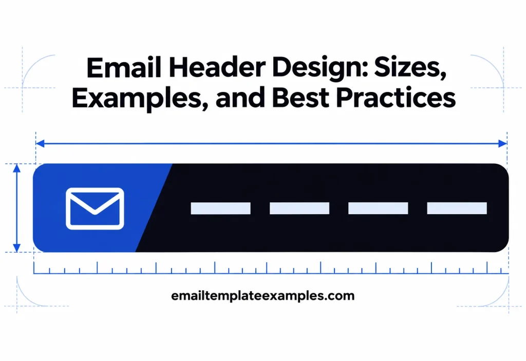
The header is the strip at the top of an email that tells the reader who sent it before they read a word: usually a logo, sometimes a row of links, sometimes a banner image. Good email header design does that job quickly and then gets out of the way, so the headline below it gets the attention.
This guide covers the sizes vendors publish for header images and banners, what to put in the header, how to keep a logo visible in dark mode and with images turned off, and nine header styles from real templates. One note on terms: “email header” can also mean the technical lines a mail program attaches to every message (From, To, Subject, Date and routing data). This article is about the visual header that readers see.
What an email header is for
HubSpot’s email design guide describes the header as the visual introduction to an email, typically holding the logo and navigation, and says it establishes brand recognition and sets expectations. That framing suggests two jobs and no more:
- Identify the sender. The reader should recognize the brand within a second.
- Set the tone. A quiet wordmark signals a transactional message; a menu bar and banner signal a shop.
Anything else in the header takes space from the content. On a phone, the first screen is small, and a tall header can push the headline and button out of view.
Email header size guidelines from vendor pages
Exact pixel sizes depend on the template width, so the safest figures are the ones email platforms publish for their own templates. All of the numbers below come from Mailchimp’s help and design reference pages.
| What | Size | Source |
|---|---|---|
| Classic template content width | 600 px | Mailchimp: about template widths |
| Header image in a 600 px template with 10 px padding | 580 px wide | Mailchimp: about template images |
| Full-width image, classic templates | at least 564 px, up to 1,200 px | Mailchimp: image requirements for templates |
| Full-width image, new builder | at least 660 px, up to 1,320 px | Mailchimp: image requirements for templates |
| Maximum file size per image | 1 MB | Mailchimp: image requirements for templates |
| Resolution | 72 DPI is generally enough | Mailchimp: image requirements for templates |
Notice that none of these pages give a fixed header height. Height depends on the design, and the practical limit is how much of the first phone screen you are willing to spend before the headline appears.
Export at double size for sharp screens
High-density phone and laptop screens make images look soft unless they carry more pixels than they display. Mailchimp’s design reference page about email images puts it plainly: a 600 by 600 px header image needs to be 1,200 by 1,200 px for HD displays. The same idea explains the upper limits in the table above. Export at twice the display width, then set the display width in the HTML.
Mailchimp’s page on the new builder’s image content blocks recommends a minimum of 660 px and 1,320 px for retina screens, and notes that the builder constrains the display size for you. If you code by hand, you do that constraining yourself with the width attribute.
Logo size
Mailchimp’s requirements page suggests a minimum width of 564 px for default logo blocks in classic templates, matching its full-width image block, because the block can stretch across the content area. Most brands do not want a logo that wide. A common approach is to export the logo at double its display size and show it much smaller, letting the header padding provide the space around it.
Which image formats are safe in a header
The format matters as much as the size. Support data from Can I Email, as of October 2026:
- PNG and JPG remain the safe defaults, with PNG for logos that need transparency.
- WebP has broad support: Can I Email’s WebP page estimates 88.1% full and 9.52% partial support.
- SVG is risky for a logo. Can I Email’s embedded SVG page estimates only 38.1% full and 2.38% partial support.
- CSS background images, often used for banners with text on top, reach 72.09% full and 18.6% partial support according to Can I Email’s background-image page.
Mailchimp’s rundown of what HTML email cannot do puts background images in its use-with-caution group, so a banner that depends on one needs a fallback. Desktop Outlook on Windows needs extra work for them. Litmus’s guide to Outlook rendering differences explains that those versions render with Microsoft Word, and that VML code can add background images there. Litmus also notes that 120 DPI scaling on Windows can enlarge images, which is one more reason to set explicit widths.
Keep the header readable with images off
Many inboxes hold back images until the reader allows them, and a header built as one picture vanishes when that happens. HubSpot shows this with a sender whose brand name and logo were both inside an image, so neither appeared when images were disabled. Its advice is direct: if you want something read, do not embed it in an image.
A few ways to make a header survive:
- Use a text wordmark. Several of our templates set the brand name as styled live text, so it shows even when images are blocked.
- Write useful alt text. If the logo is an image, the alt text should be the brand name, styled to match.
- Keep headlines out of banners. Put the headline in live text on top of, or below, the photo.
- Set a background color behind banner images. If the image fails to load, the color still frames the live text.
HubSpot goes further and argues that large hero images suit websites better than email, because of image blocking. That does not rule out banners, but it does mean the banner should never be the only place the message lives.
Make the logo work in dark mode
Dark mode can turn a dark logo on a transparent background into a dark shape on a dark screen. Litmus’s dark mode guide for email marketers suggests a translucent outline around transparent PNGs with dark text, for clients where dark mode control is limited, such as the Gmail app and Outlook 2019 on Windows. It also describes a glow or a white stroke as options, or placing the graphic on its own background and flattening it when its original look matters most.
Apple’s dark mode design guidance, written for app designers, make a related point: if an image looks right in only one appearance, change it or make separate light and dark versions. Apple also suggests slightly darkening images with white backgrounds so they do not glow against dark surroundings, which applies just as well to a logo on a white box.
Where the client allows it, you can swap logos entirely. Litmus describes classes that reveal an image meant only for dark mode when the prefers-color-scheme: dark condition is true. Our templates use the same idea: in the code of our Black Friday Early Access email, a light logo class is hidden and a dark logo class is shown when the reader’s device is in dark mode. Every template page also offers a Dark preview, which makes it quick to spot a logo that disappears.
Nine email header examples
Browsing these templates and copying their HTML costs nothing. Editing one in the editor needs a free account.
1. Text wordmark only
The One-Time Passcode email opens with a small serif wordmark set in live text, then goes straight to the seven digit code. For a security email, a header this light keeps the code on the first screen.
2. Color band with a thin wordmark
The Gradient Password Reset template uses a deep teal band and a thin lowercase wordmark. The band does the branding, so no logo file is needed.
3. Boxed wordmark and menu bar
The Womens Fashion New In email sets the brand name in a boxed live-text wordmark, then a menu bar with five text links: Home, New, Dresses, Shoes and Journal. Text links in the header give shoppers a way into the store without a single image.
4. Text menu above a headline
The Low Stock Last Few alert puts a simple text menu above a left-aligned headline, followed by bordered product cards. It shows that navigation does not need a colored bar to work.
5. Wordmark with links on one line
The Invoice Ledger Classic template pairs the wordmark with links, then moves to the invoice title and three key figures. For billing email, the header stays businesslike.
6. Black header
The Phone Reignite Offers email starts with a black header before a split panel with a phone photo. A strong dark band creates contrast with the product image below.
7. Wordmark with tagline over a photo banner
The Wine Tasting Evening invitation has a text wordmark with a one-line tagline, then a banner of vines at dusk with a live serif headline on top. In the code, the banner is a background image with a dark purple fallback color and a VML version for desktop Outlook, so the headline stays readable if the photo never loads.
8. Photo banner under live text
The Hotel Grand Opening announcement shows a rooftop terrace at sunset under live text. It is a good model for any announcement where the place itself is the message.
9. No logo at all
The Job Offer Letter has no logo, just one headline and the offer details as neat rows. For a personal, high-stakes message, leaving out the branding makes it read like a letter rather than a campaign.
You can find more header styles across the Password reset templates and Product launch templates categories, or the whole template library. More designs, sorted by what they are good for, are in the planned list of best email templates.
Header choices by email type
| Email type | Header that usually fits |
|---|---|
| Security, password reset, passcode | Wordmark only, or a color band |
| Receipt, invoice, statement | Wordmark with a few account links |
| Shop promotion, new arrivals | Wordmark plus menu bar, optional banner |
| Event, opening, announcement | Wordmark, then a photo banner with live text |
| Personal letter, job offer | Minimal or no branding |
The article on email layout explains how the header connects to the rest of the message, and the visual system around it, from type to color, in the article on email design. For what happens to a header on a narrow phone screen, see our upcoming article on responsive email design.
FAQ
What size should an email header be?
For a 600 px template, Mailchimp suggests a 580 px header image when there is 10 px of padding on each side, exported at double size for sharp screens. Its newer 660 px builder calls for at least 660 px, or 1,320 px for retina.
What is the right email banner size?
Banners follow the full-width image figures: at least 564 px in Mailchimp’s classic templates, or 660 px in its new builder, with files under 1 MB. Height is up to you, but keep the headline on the first phone screen.
Should the logo be an image or text?
An image gives exact brand styling, and live text survives image blocking. Many senders use an image logo with brand-name alt text, or a styled text wordmark for transactional email.
Can I use an SVG logo in email?
It is risky. Can I Email estimates embedded SVG support at about 40% of tracked clients, so a PNG is the safer choice.
Should the header include navigation links?
Only if readers are likely to browse, as with a shop. For one-action emails, links in the header compete with the main button.
Start with the first screen
A header earns its space by identifying the sender and setting the tone, then handing the reader to the headline. Use sizes from your platform’s own documentation, export at double resolution, keep the brand name readable with images off and in dark mode, and test on a phone. To compare header styles side by side, pick a few designs from our collection of email templates and flip each one through its Light, Dark and phone previews.