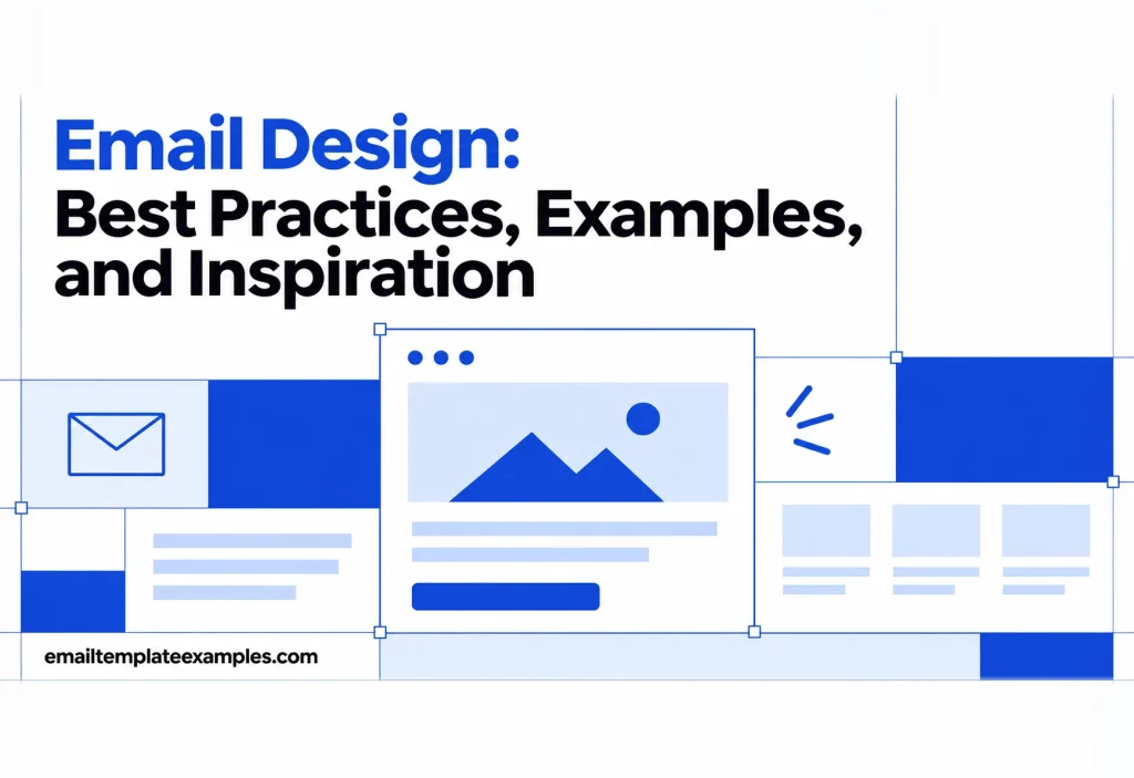
Email design is the visual side of a message: the type, the colors, the photos, the spacing between blocks, and how all of that survives dark mode, a small phone screen and a dozen different email apps. Litmus puts it as the process of strategizing, creating and testing the visual look and layout of your campaigns. This guide sticks to that craft. It covers each part in a short section, shows a few templates that handle it well, and points to deeper guides where one topic needs more room.
If your question is how design choices affect clicks and sales, our planned guide to email marketing design takes that angle. Here the goal is an email that looks right and reads easily everywhere it lands.
Why email design is its own discipline
A web page runs in a browser that follows modern standards. An email runs inside someone else’s app, and each app decides which code it honors. According to Mailchimp’s page on the limits of HTML email, JavaScript, iframes and forms are blocked or unsupported in email, web fonts fall back to standard fonts where they are not supported, and background images do not display in every client. That is why email designers still lay out emails in tables with inline CSS, and why every layout decision has a plan B.
The audience also skews to a few apps. Litmus’s market share data for September 2026 puts Apple Mail (including Mail Privacy Protection) at 76.56% and Gmail at 16.10% of the opens it tracked, about 93% combined, with desktop Outlook at 3.48%. Design for those first, then check the rest.
Email design best practices for layout and spacing
Start narrow. HubSpot’s email design best practices recommend a single-column layout that is 600 pixels wide or less, so nobody has to scroll sideways, and Mailchimp notes that many viewing panes cut off messages wider than 600 to 800 px. Every template in our library previews at 600 px for desktop and 375 px for phones for the same reason.
Inside that width, spacing does most of the work. Litmus recommends using white space to cut clutter, and in practice that means:
- Equal padding inside every block, so the eye reads a rhythm rather than a pile
- More space above a heading than below it, which ties the heading to its own text
- One clear primary button per screen, with secondary links set as plain text
- Columns that stack on small screens instead of shrinking to unreadable widths
Planning the order of blocks (hero, story, offer, footer) is a topic in its own right. Our guide to email layout covers grids, column counts and stacking patterns, and the planned piece on responsive email design goes into media queries.
Email typography
Use live text for anything that matters. Text baked into an image disappears when images are blocked and cannot be read by screen readers. Litmus advises choosing between web-safe fonts, which every client has, and web fonts, which may not appear as intended. A web font is fine for a headline as long as the fallback in your font stack still looks acceptable.
For size, HubSpot suggests body text of at least 14 pixels on mobile and tap targets of at least 44 by 44 pixels. Beyond the numbers, a few habits keep type readable:
- Limit yourself to two typefaces: one for headings, one for body
- Keep body lines short, around the width of the 600 px column minus padding
- Left-align long paragraphs; center only short headlines and buttons
- Use weight and size for hierarchy before you reach for color
Color and contrast
Pick a small palette: a background, a text color, one brand accent for buttons and links, and one neutral for panels. More colors than that usually makes an email look busy rather than branded.
Contrast is the rule that cannot bend. Apple’s Human Interface Guidelines on Dark Mode ask for a contrast ratio no lower than 4.5:1 between foreground and background, and suggest aiming for 7:1 with custom colors, especially for small text. Apple writes that for apps, but the same numbers are a sound check for email copy, including light gray footer text that often fails it.
Images and buttons
Photos set the mood, but they are the part most likely to break. Give every meaningful image short, descriptive alt text, as Litmus recommends for people with images off and for screen readers, and mark purely decorative images with empty alt text. Keep file weight down too. Gmail clips messages over 102 KB of HTML, which is why each template page here shows its size against that limit.
Buttons deserve special care. Litmus’s guide to bulletproof buttons describes them as call-to-action buttons built with HTML and CSS instead of images, so they remain visible with images switched off and can be edited in the template rather than in a graphics tool.
Headers and footers
The header is the first thing a reader sees after the subject line, so it should identify the sender at a glance: a logo or wordmark, sometimes a short menu, rarely more. Our guide to email header design covers logo sizing, preheaders and navigation bars in detail.
The footer carries the legal and practical parts: your address, why the reader is getting the email and how to leave. Litmus warns against burying the unsubscribe link, and Google’s email sender guidelines tell bulk senders, meaning those above 5,000 emails a day to Gmail, to offer one-click unsubscribe in marketing mail, plus an unsubscribe link people can plainly see inside the message. Design the footer so that link is easy to find, not hidden in pale gray.
Dark mode
Dark mode is no longer an edge case. The Litmus market share report says it is used by over 25% of the total user base. The harder part is that email apps do not handle it the same way. According to Litmus’s guide to dark mode for email, clients fall into three groups:
- No change: the app UI goes dark but your email looks exactly as designed.
- Partial color invert: light backgrounds turn dark and dark text turns light, while areas that were already dark stay put. Most clients in this group let you target dark mode with your own styles.
- Full color invert: both light and dark areas are inverted. Litmus lists the Gmail app on iOS, Outlook 2021 and Office 365 on Windows, and Windows Mail as using this approach, and these clients do not allow dark mode targeting.
Practical defenses help in all three cases. Litmus suggests adding a thin translucent outline to transparent PNG logos with dark text, so they stay legible when the background flips. Where targeting works, a prefers-color-scheme: dark media query lets you swap in your own dark colors and even a light version of the logo. Each template page on this site has Light, Dark and Gmail views, so you can see how a design behaves before you commit to it.
Accessibility
Good email design and accessible email design are mostly the same thing. Before you send, check that:
- The email makes sense with images turned off
- Body text meets the contrast ratio above and is not smaller than 14 px on phones
- Links say where they go (“See the schedule”, not “Click here”)
- Headings are real text in a logical order
- The reading order still works when columns stack on a phone
- Buttons are large enough to tap with a thumb
How email apps change your design
Even with careful code, the same email will look slightly different from app to app. Google’s Gmail CSS reference says Gmail supports CSS in a <style> block in the head, class, element and ID selectors, and media queries, and that most CSS selectors, attributes and media queries are supported. Other clients are stricter. Can I Email keeps support tables for HTML and CSS features across email clients, and it is worth checking any property you have not used before.
Litmus recommends progressive enhancement: build a version that works everywhere first, then add extras for clients that support them. Rounded corners, web fonts and hover effects are extras. Readable text, working links and a visible button are not.
Email design examples from our library
These templates each show one principle clearly. Open the page to switch between desktop, phone, light and dark views.
- Type as the hero: the Year in Review Wrapped template puts a huge orange “2026” on black, with the listening numbers set in type rather than charts.
- Editorial imagery: the Architecture Studio Journal template pairs a white building photo with three tall project photos and a founder quote, leaving plenty of white space.
- Less is more: the Plain Note With One Button template has no logo and no images, just a few lines on a white card and one full width blue button.
- Dark by design: the Developer Conference Invite template uses neon code art, mono headings and deep blue, a useful test of how a dark-first email holds up in full-invert clients.
Where to find more email design inspiration
Real brand emails are a good source of ideas as long as you borrow principles rather than copy layouts. HubSpot’s collection of email design examples shows sends from companies such as Casper, Harry’s and Apple. The Litmus email design best practices guide adds advice on modular design systems, where a set of reusable blocks keeps every campaign consistent. For newsletters in particular, our planned guide to newsletter design will collect patterns for recurring sends.
FAQ
What is the standard width for an email design?
Most designs use a single main column of about 600 px. HubSpot recommends 600 px or less, and Mailchimp notes that many viewing panes cut off emails wider than 600 to 800 px.
Should I design emails for dark mode?
Yes. Litmus reports dark mode use at over 25% of its tracked user base. Test your design in light, partial invert and full invert clients, and make logos and images work on dark backgrounds.
Can I use custom fonts in email?
You can, but only some clients load web fonts. Others fall back to the next font in your stack, so choose a fallback that keeps the design intact.
How do I make an email design accessible?
Use live text, alt text on meaningful images, strong color contrast, descriptive link text and large tap targets, then check the email with images turned off.
Putting the design rules together
Strong email design is mostly restraint: a narrow column, a small palette, readable type, real buttons and a plan for dark mode. Start from a layout that already gets those basics right and spend your time on the content. To see these principles at work, browse the template library and compare the dark and phone previews.