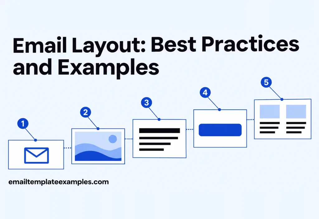
An email layout is the arrangement of blocks inside a message: where the logo sits, how many columns each row has, what order the sections come in and where the button lands. Good layout makes an email feel short even when it holds a lot, because the reader always knows where to look next.
This guide covers structure only. It walks through seven common email layouts, explains when each one fits, and shows a real template for every pattern so you can open the code and copy the structure. How those structures shrink onto a phone is a separate, code-level subject, and our planned guide to responsive email design handles it.
What makes a layout work
Before choosing a structure, decide what the email is for. Litmus’s list of email design best practices advises building the visual hierarchy around the goal of the message and keeping to a single goal per email, so the most important element is also the most visible one. The same article recommends generous white space so the main point is not buried under clutter.
That gives three questions to answer before you draw a single box:
- What is the one action you want from the reader?
- What does the reader need to know before taking it?
- What can be cut, linked to, or saved for the next send?
The answers decide the layout. A password reset needs one block and one button. A weekly roundup needs a scannable list. A product launch needs a story that builds toward a decision.
Email layout best practices for width and columns
A few structural rules hold across almost every pattern below.
Keep the content area narrow. Mailchimp’s help article on template widths says its templates are no wider than 600px so they fit the display capabilities of most email clients. Its newer builder uses 660 px. Either way, the reading column stays far narrower than a web page.
Build with tables. Mailchimp’s guide to the limits of HTML email treats static tables, including tables nested inside tables, as safe, wide layouts as something to use with caution, and layered div elements as something to avoid entirely. That is why every block in an email template is, under the hood, a row in a table. Newer CSS layout tools are not a full replacement yet: Can I Email’s display:flex page estimates 78.05% full and 4.88% partial support, which still leaves a noticeable group of clients where a flexbox layout would fall apart.
Use fewer columns than you think. HubSpot’s email design article suggests that when in doubt you should stick to a single column. Two columns work for short items like products or photos. Three or four columns leave very little room per item and usually collapse on phones anyway.
Size images to their column. Mailchimp publishes minimum image widths for each column count in its image requirements for templates:
| Columns in the row | Classic templates (600 px) | New builder (660 px) |
|---|---|---|
| One, full width | 564 px | 660 px |
| Two | 264 px | 330 px |
| Three | 164 px | 220 px |
| Four | 132 px | 165 px |
Those numbers are a useful reality check. A four column row in a classic template leaves each product photo at roughly the width of a thumbnail.
Seven email layout examples
Each pattern below links to a free template in our library that uses it. Browsing and copying the HTML is free, and editing a template needs a free account.
1. Single column letter
The plainest layout: a logo or wordmark, a block of text, and a sign-off. It reads like a personal note, which suits notices, policy updates and founder messages. The Terms Update Plain notice lists three changes as a short numbered list, gives the start date, and has no button at all, because the job is to inform, not to drive a click.
Use it when the words matter more than the visuals, or when the email should not look like marketing.
2. Inverted pyramid
HubSpot recommends an inverted pyramid for body copy, and the idea works as a layout too. A wide top block sets up the message, a narrower middle explains it, and everything funnels down to one button. The Verify Email Envelope template follows this shape: a spaced wordmark, a large envelope icon, a short line of copy, then one rounded teal button, with a three column footer of links below the point of action.
It is the default choice for any email with a single action: confirmations, invitations, trial reminders.
3. Zigzag
A zigzag layout alternates image and text from side to side, row after row. The eye moves left to right, drops down, then right to left, so the reader keeps moving through the email. The Creative Studio Intro welcome uses three alternating split panels, then a small portfolio, two blog posts, a numbers band and footer columns.
The Fashion Up to 50% Off holiday email applies the same pattern to retail, with four alternating product panels with prices below a menu bar and photo hero. Zigzag works when each item needs a sentence or two of context, not just a picture and a price.
4. Grid
A grid places equal tiles in rows, usually two across. It suits content where the images do most of the talking: portfolios, galleries, product collections. The Design Agency Portfolio newsletter opens with a centered wordmark and a bold statement, then shows eight project photos in a two column grid with names and fields, closing with dark footer columns.
Keep the tiles uniform in size and caption length. A grid with one tall tile and one short tile looks broken, especially once it stacks.
5. Cards
Cards group related facts into bordered or shaded boxes, which makes transactional details easy to scan. The Plan Renewal Receipt splits a subscription receipt into two cards: the amount paid and invoice details on top, and the billing period with plan, add on, discount and total below it.
Cards work well for receipts, statements, event details and anything a reader might come back to and search for later.
6. Long multi-section
Some emails carry several pieces of content on purpose, like a weekly newsletter or a restaurant menu. The trick is to give each section a clear start: a heading, a divider or a change of background. The Bistro Weekly Menu runs from a dark food photo hero through a kitchen video, the week’s dishes grouped by meal, house facts, two stories and the cooks. Its file weighs 52.2 KB, heavy by library standards but still under the size at which Gmail clips a message.
For layouts like this, the planned guide to email newsletter design covers section order and recurring formats in more depth.
7. Menu bar and hero
A storefront layout places a wordmark and a row of navigation links above a large opening image, then hands off to a grid or zigzag below. It borrows the familiar shape of a shop home page. Our article on email header design looks at the top of this layout in detail, including logo and banner sizes.
Choosing a layout for the email type
Here is a quick way to match the structure to the job.
| Email type | Layout that usually fits | Why |
|---|---|---|
| Notice, policy change, founder note | Single column letter | Reads as a message, not an ad |
| Confirmation, invite, trial reminder | Inverted pyramid | Funnels attention to one button |
| Product story, welcome tour | Zigzag | Each item gets image and context |
| Portfolio, gallery, collection | Grid | Images carry the content |
| Receipt, statement, booking | Cards | Facts are grouped and easy to find |
| Weekly newsletter, menu | Long multi-section | Several items, clearly separated |
| Shop promotion | Menu bar and hero | Familiar storefront shape |
You can browse examples of each by category, for instance Newsletter templates for grids and multi-section layouts, across all 258 templates in 28 categories in the full library.
Section order inside any layout
Whatever the structure, most marketing emails follow a similar sequence from top to bottom:
- Preheader text, the short line many inboxes show after the subject
- Header with logo, and navigation if the brand has a shop
- Headline or hero that states the point of the email
- Supporting content: products, stories, details
- The main call to action
- Secondary links or related content
- Footer with address, preferences and unsubscribe
Two adjustments are worth making. First, if the email has one action, put the button near the top as well as at the end, so readers who already know what they want do not have to scroll. Second, keep the footer quiet. It is required, but it should not compete with the main button.
Balance text and images
A layout made only of pictures is fragile. Mailchimp’s email design reference on images warns that many email programs block images by default, and a message built from one big image shows up as an empty frame. HubSpot’s guidance is to avoid image-only emails and aim for roughly 60% text and 40% images.
In layout terms that means:
- Headlines, prices and dates in live text, not baked into a picture
- Alt text on each image that carries meaning, so a reader with pictures blocked can still follow the structure
- Buttons coded as HTML, so they show even when nothing else loads
The Terms Update Plain example sits at one extreme with no images at all, and the grid layouts sit at the other. Most emails land somewhere in between.
FAQ
Which email layout should I start with?
There is no single answer. A single column or inverted pyramid layout fits most emails with one goal, while grids and zigzags fit emails that show several items.
How wide should an email layout be?
Mailchimp keeps classic templates at 600 px and its newer builder at 660 px. Our own templates hold content to 600 px on desktop and let it widen to fill the screen on phones.
How many columns can an email have?
Technically up to four in one row, but image space gets tight. At four columns, Mailchimp’s minimum image width in a classic template is 132 px. Two columns is a safer upper limit for most content.
Should every email use the same layout?
Keep the header and footer consistent so readers recognize the brand, and change the middle to suit the content. A receipt and a newsletter from the same sender can look related without sharing a structure. Shared fonts and colors do most of that work, and our article on the visual side of email design explains how to set them.
Sketch it before you build it
A practical way to pick a layout is to sketch the email as boxes before writing a word: one goal, the facts the reader needs, then the button. Match that sketch to one of the seven structures above, and start from a template that already uses it rather than from a blank file. Every pattern in this guide has a working example in the template library, ready to preview at desktop and phone width.